Steven Spielberg is a plagiarist!
Clearly owes it all to Disney
That’s right, the acclaimed wunderkind director/producer/writer/gaffer/best boy has been blatantly stealing from Disney for years.
First he steals Robert A. Mattey, the special effects supervisor who created the giant squid effects for Disney’s “Twenty Thousand Leagues Under the Sea”, to create the mechanical shark used on “Jaws”. Any fan of “Jaws” knows that the shark worked so flawlessly and was so perfectly precise in it’s movements and subtle gestures that it was the sole reason for the films blockbuster success.
Chimps = High quality drama
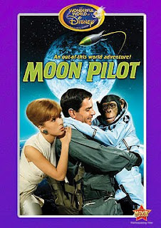
After robbing Disney of its ace FX wiz Spielberg went on to ape Disney’s 1962 beloved seminal classic film “Moon Pilot” with both “Close Encounters of the Third Kind” and “E.T”. Shamelessly stealing not only the outer space theme but also the idea of a cute chimpanzee sidekick (E.T. was some sort of space monkey, right? I’ve never seen it).
Don’t believe him Michael, he is full of lies!
Mr. Spielberg went on to direct some flop called “Raiders of the Lost Ark” (Google it if you would like more info on this obscure film) that obviously pays homage to Disney films such as “Treasure Island” and “Swiss Family Robinson”. But it is not until 1985 that Spielberg made his most audacious move.
The story of a young woman growing up
during the dawn of a new Disney era.
Hailed as his coming of age, the first “serious” film of his career Spielberg directed “The Color Purple”, a flat rip off of Disney’s then young EPCOT Center.
Wait! What on earth does “The Color Purple”, a film about a troubled young African American girl growing up in the early 1900’s have to do with a Reagan-era 1980’s theme park celebrating the harmony of mankind and it’s optimistic view of the future? It’s right there in the title… THE COLOR PURPLE!
Epcot comes in any color you want, as long as it is purple.
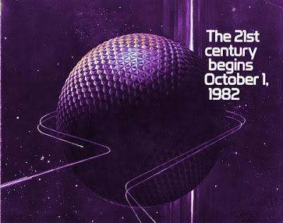
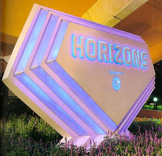
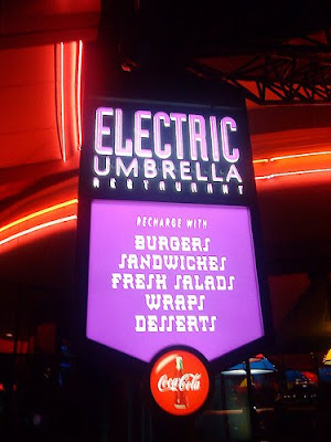
When Epcot Center opened in 1982 and for most of its early existence through the 1980s it was awash in the cool, soothing tones of purple. The Future World half of the park was painted almost exclusively in a rich purple pallet. Its mascot Figment was purple, show buildings were purple, logos were purple, virtually every pavilion had some nod to the mixture of red and blue… apparently the future was going to be purple!
Listen and you’ll hear the heart beat…
…of the Universe teaming with purple.
Forget looking at the world through rose colored glasses, Disney saw it as a lavender glow, a royal purple neon stripe or plush violet carpet. There is no other color I so closely associate with a specific time and place as purple and 80’s EPCOT Center. Purple in general was not strictly an 1980’s color mind you. It is not like associating avocado green with 70’s appliances; merely a fashion choice dictated by then current trends, no purple was unique to EPCOT Center. It symbolized a cool high tech glow, a hopeful future and a regal outlook on things yet to come, purple embodied all EPCOT Center was and wanted to be.
In the future carpet is both purple and has cool logos.
The carpet in Communicore was not only purple but had the actual Comminicore logo woven right into it. The garbage cans were purple, many of the chairs and benches were purple and the exterior of the Imagination Pavilion was purple.
On the outside…
On the ride…
Everywhere you looked…
Purple baby, PURPLE!
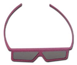
In fact purple was the color of choice for the Imagination Pavilion in general. The load area for Journey into imagination had purple carpet, the far ahead of their times 3-D movies (Magic Journeys and later Captain Eo) used purple 3-D glasses, many of the show scenes of the ride as well as the hands-on exhibits in the Image Works featured shades of purple and of course Figment himself was “Royal purple pigment”.
The purple cartoon mascot of Epcot Center.
Eventually Kodak (the pavilions sponsor) woke up and saw the (non purple) light. While they had always banned the color green from being prominently featured in the pavilion (for it was the color of arch enemy Fuji Film) they seemed OK with purple. Then somebody realized that purple was not Kodak’s color and why the heck were they spending millions of dollars to push purple down our throats… and so in 1998 the building became yellow and red… Kodak colors, and the purple faded away.
The purple feels like you could reach out and touch it.
With the disastrous rehab of the Imagination Pavilion more than just the color of the building changed. Disney gutted the ride, painted the vehicles from purple to red and shuttered the wonderful Image Works and all of it’s associated purple hues. The capital of the purple front had fallen for good.
Not to be out done…
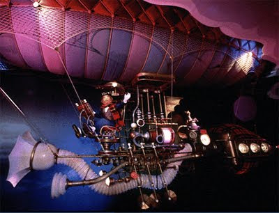
Still, there was a time when Spaceship Earth stood proudly lit with magenta, and the full spectrum of purple tones. Horizons (a generally non purple affair) featured the hue in it’s early scenes depicting what past visionaries foresaw as our future and later in the space settings, and the final scenes of World of Motion depicted our future cities buzzing with deep blues, purples and indigos. When it came to living in the future purple was it.
Close cover before going purple.
Bits of EPCOT Center that are now gone for good reveled in their purple-ness. Things like matchbooks that formerly were available at EPCOT had not only purple on the cover, but the matches themselves as well.
The official album is officially purple.
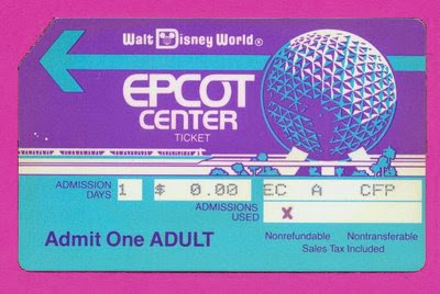
The official album of EPCOT Center (we are talking vinyl baby) was proud to be purple. Even the original EPCOT Center tickets were predominantly purple. To this day when I see purple EPCOT leaps to mind. Purple is everything the park aimed to be: unique, off beat, different, comforting, soothing, forward thinking, challenging and rich.
Your ticket to purple nirvana.
As time went on more and more of the purple vanished. Custom carpets were replaced with generic ones, walls were painted, entire pavilions were destroyed and with each move the purple was watered down more and more until barely any exists. You can still see a bit here and there at the former Communicore (now annoyingly called Innoventions!) and sprinkled throughout the park but it is no longer the indigo wonderland that it once was.
A few purple refuges of a past era.
And a few new throw backs to purple days of yore.
In fact it is a telling metaphor for all of today’s Epcot that Innoventions current carpet is a watered down Mauve color (a pale and weak version of the rich purple that used to line the halls) accented by a dated teal tone. It’s a fantastic irony that these muted tones are much more dated and 80’s feeling than the carpets that originally called EPCOT Center home.
Epcot or a 1987 Marriott convention center?
Sadly these photos were taken in July of 2010.
Oddly enough the star of the film “The Color Purple” Whoopi Goldberg turned into a Disney staple and has also been featured in several doomed Disney attractions, most notoriously both Superstar Limo and Golden Dreams at Disney’s California Adventure. I guess she figured that if you can’t plagiarize them join them. Meanwhile Steven Spielberg went on to an unremarkable career before fading away into obscurity. However there is talk that he may direct a new film based on the current version of Epcot, the working title is “The Color Beige”.
I have run out of ways to say purple.
Whether purple turned out to be the color of the future or if the imagineers were simply taking too much LSD “Try the purples man…” it does not really matter, for there was a time when deep, rich, saturated, beautiful purple was EPCOT Center and the future was so bright you had to where (purple) shades!
Maybe a little like these.















This is the stupidest post ever. One, he didn’t steal Disney’s FX Wizard. Two, The Color Purple was a book before the movie and just because a theme park has a lot of purple in it doesn’t mean that they own the color purple. Finally, you can’t own the space theme, anybody can use it and E.T. is about an alien trapped on earth not just some monkey who goes into space.
Q:
This might not be the right blog for you… I’m just saying.
(hint: it’s a joke)
That sounds WAY better than the cartoon suit I have to wear from my site…that thing is HOT. Plus the Mickey bar is always melting.
Wait… Shane, aren’t you wearing the officially
sanctioned Parkeology Jean cut off shorts and
neon pink glitter wig? I thought we agreed to wear these on every park visit?
I wish we all had little hovering bubbles over our heads that identify us by our sites, so that if we pass each other in the parks, we can stop and say hello.
Btw, I was just outside the Imagination pavilion with George from Imaginerding yesterday and we were discussing this post and your site’s extreme awesome-osity. 🙂
I dunno, guys, I think horns of a steer kind of become that particular purple fellow…
Is it the Prince part or the Figment part that that is freaking you out Shane? I think Zanna must have exceptionally good taste!
@Zanna, please tell me it’s not because of that Prince/Figment picture, because that’s just disturbing! 🙂
I seriously want to marry this post.